KYC Redesign
Banks conduct Know Your Customer (KYC) procedures to verify customer identities, safeguarding both customers and the institution from potential financial risk. Citibank requires customers to annually update their accounts with details such as their address, employment information, and income.
The Problem
Customers often ignore the annual follow-up, with only 48% submitting the required information. Citibank is forced to close an individual’s account if they cannot verify their details.
Why do less than half of Citi customers complete KYC?
When we asked the business owners, we came to a dead end. Doing my research, I found that customers are turned off by the many steps, repetitive questions, and not knowing how long the process will take.
Business Requirements
Design Process
User Flow


The product owners tasked us to create a mobile experience for the KYC flow which would lead to increased submissions. Responsive Web was redesigned previously.
Do not stray too far from the current web design.
Achieve timely retrieval of KYC information to prevent the closure of accounts.
The challenge for mobile is creating a design with minimal scrolling that can accommodate many questions and sections.
My Director placed me on this project late as I told her my desire to work on more projects has usability tests. When I joined, we were already in the comparative analysis stage. We conducted a comparative analysis, created user flows, developed wireframes, built prototypes, performed usability testing, and implemented revisions based on the findings.
I reviewed the existing screens for the responsive web and quickly mapped out a user flow, outlining the key sections of information required—residential address, employment details, and income. We didn’t want to force them to complete everything at once but allow them to see their account.
The progress bar will fill up and checkmarks/awards pop up as you complete each section for a gamification effect.


Comparative Analysis
Blue Sky Ideation

Since I joined the team late, we began working on comparative. Given the business requirement to accommodate different sections with minimal scrolling, I researched examples of companies that employed innovative techniques to reduce scrolling and designed forms with multiple sections to be completed efficiently. What caught my attention were vertical accordion designs, horizontal tab layouts, and button-based navigation.

I utilized the vertical accordion, horizontal tabs, and button-based layouts to create four distinct design variations. I normally start with sketches and wireframes but we had a tight deadline and wanted to show the journey owners an array of designs. Therefore, I started ideation in high fidelity. Below are some designs I came up with that promoted minimal scrolling and accommodated many sections.
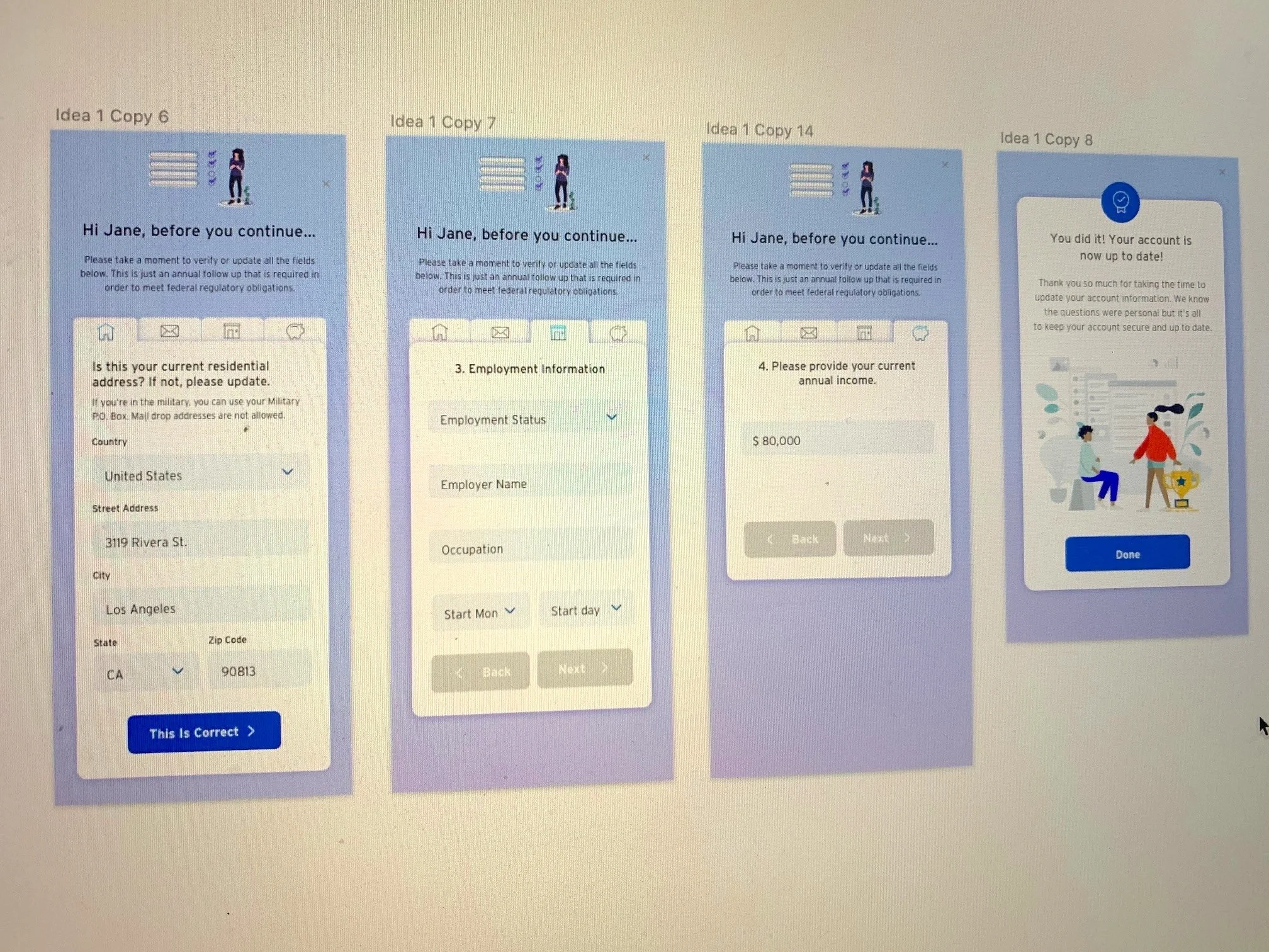
Tab Design
This design featured tabs that begins from left to right, where you would fill out one tab at a time. This promotes minimal scrolling and allows the customer to focus on one section at a time.
Rewards Motivated
Design Selection & Prototype
The Product Owners chose one design from both my coworker and myself. Out of my designs, the journey owners were most interested in exploring the accordion design that would help limit the amount of scrolling. I adjusted the colors to follow Citi branding. We also got some pushback from the developers requesting to limit the number of illustrations due to size and load time considerations. The journey owners chose a tab design from my coworker, Crystal. The plan was to test both designs and see which one performed better. We also worked with our copywriter to test two different versions of copy, one for each design.

Research Highlights
Over half said they liked Design A (top) because it felt better, fancier, and more friendly.
User Testing
All users easily understood the flow and had no problem navigating through the experience.
83%
Five out of six users were confused about how often they would receive the questionnaire, despite a tooltip indicating it was annual. This suggests that users tended to skim rather than thoroughly read the information.
Setting
We tested the designs A and B above and asked the same questions. We wanted to see which design would perform better with the questions we asked. First, we asked them to log into their account and complete their usual tasks in order to see their reaction when prompted to complete the questionnaire.
Some of the questions we asked were:
What do you usually open your Citi mobile to do?
Where might you go if you are busy and can’t complete the questionnaire at this time?
Where would you find more information about the questionnaire?
Have you seen this type of questionnaire before?
66.66%

Impact & Takeaways
The submission rate increased from 48% to 74% from 2020 to 2022. Engagement rates have also increased after mobile was introduced and KYC was redesigned.
The next steps which my coworker worked on after I left Citibank was working on the Business Owners and Trusts flow using the designs I implemented.
During a Lunch and Learn session at Citibank, the other Crystal and I had the opportunity to present this project to the broader design teams and over 100 employees. The project's success was a direct result of the team's humility and strong collaboration.
This project and presentation highlighted the critical role of usability testing and the value of crafting user-friendly copywriting.

Accordion Design
Vertical expand and collapse menu using a curved progress bar that resembles Citi’s logo. Sections expand and collapse in order from top to bottom. When you fill out one section, it will collapse and the next section will expand open. You can also go back to edit previous sections.

Chatbot Design
This one relies on future technology for Citibank but the idea was you could talk to a VR assistant/bot, who would ask you account update questions and you could either type or use voice technology to answer by voice. This one was a little far-fetched but the journey owners loved the idea to explore in the future.

33%
When asked where they would go if they didn’t have time to complete the questionnaire, 2/6 users said the close button was not very apparent and they were looking for a button that said “skip” instead.
33%
2/6 users said they thought design B (bottom) had a stricter feel so they would more likely fill out the form.
Design Revisions
COPY CHANGES
We made the text more concise based on user testing, which revealed that people tend to skim.
The tooltip was shortened by removing the section about recording user information and emphasizing the words "annually" and the phone number in bold to make the text easier to skim.
The header for the residential address was rephrased to clarify why verification is necessary, as some users were confused about why they needed to confirm the information we already had.
The top navigation header was changed from "Update Profile" to "Attention Required" because users felt a greater sense of urgency and prompted immediate action.
"Close" was changed to "Skip" because testers indicated they were searching for a skip button when asked where they would go if they couldn't complete the questionnaire.
UI CHANGES
Tried to marry the designs of A and B.
Design A was made to align more with Citi branding and create a more mature atmosphere. Although testers found the original design more fun and pleasant, it made them less likely to take the questionnaire seriously.
The progress bar was removed because the Product Owners noted that all sections were visible without scrolling and that creating the bar would take considerable time.
The CTA buttons were made smaller because testers were clicking them without reading the content.
The success screen button was removed and we decided to make the screen a timed one. From a user standpoint, it’s best to have fewer clicks or button presses for the user.
The review and submit screen was revised to show all the information that the user reviewed so they could go back and edit without having to expand the sections in order to review them.
The illustration screen was taken away to promote a stricter feel.


What I would have done differently…
It would have been beneficial to dedicate more time to user research beyond developing a user flow and performing a brief competitive analysis. This could include conducting usability tests on the current responsive web experience, holding user interviews, and creating detailed personas. Moreover, I do think it would have been better if we used data to decide which of the many wireframes to move forward with instead of having the product owners choose.